
mason jar / sofia / marsala / workspace
When (The) Marge Aberasturi told me she wanted me to redesign her brand and her business sites, I was at first shocked, and then in denial, and then scared—pretty much went through all the stages of acceptance. LOL. Let’s just say, for months I was simply a quiet member/lurker of the Manila Work at Home Moms (WAHM) Community, where Miss Marge is much loved, and revered, and looked up to as THE Ultimate WAHM guru. And then we got to know each other in this Online Marketing workshop last year, and really, I was in a state of disbelief that she’d even.. talk to me, mere mortal.
Haha, ok, I’ll cut it out. Miss Marge is the most down to earth and approachable person in the world, and it was just so easy to work with her. It almost felt like our brainwaves were connecting in a level not a lot of people would understand. In fact, because of that weird connection, we skipped a couple of steps in the design process. And because we were speaking the same WordPress language (she’s a WordPress admin guru), we were working on the site almost simultaneously—me on the design front, and she on the site’s content, structure, and plugin configurations.
I worked on two different logo designs for her.
First, Marge Aberasturi’s Personal Brand Design
As you notice, even her color preferences resonated with mine. We used gold and navy blue for her logos, and added Marsala accents on the site’s design. With the professional and minimalist look that she’s after, here are the logo studies I presented to her.
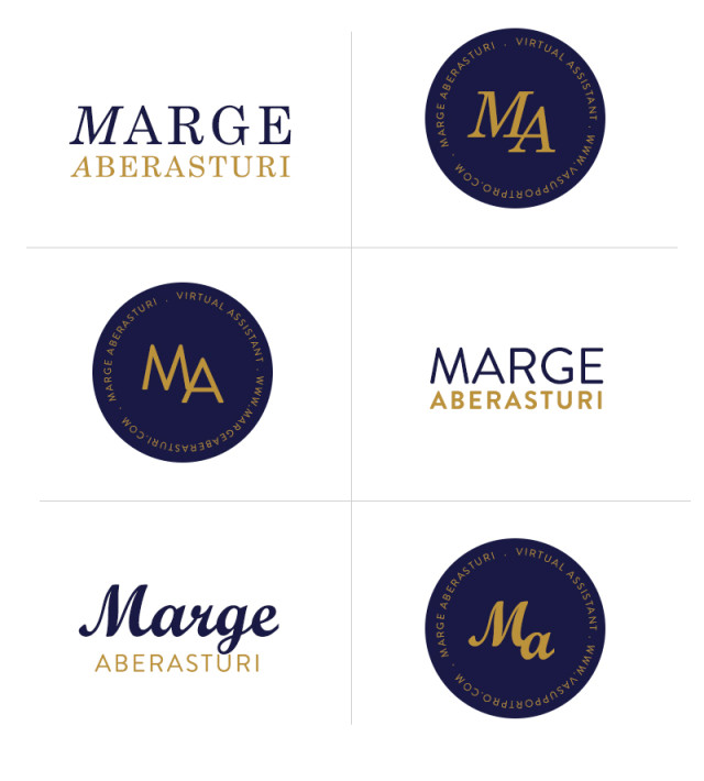
On a side note, we were working on all of these during the Christmas break. In the midst of reunions and Christmas dinners and gift giving, we would chat on Facebook in the wee hours of the night exchanging ideas and trading (ehem) secrets. ;) I guess we both knew how busy both of us would be once the new year kicked off, that’s why we were both working on personal projects during the break. More so, we found solace in the thought that someone else other than ourselves was working during the holiday break. Hehe.
Anyway, the final logo was a super clean and classic logo design that represented her professionalism, trusthworthiness, and years of solid experience in the industry.
Read Miss Marge’s blog post about this project HERE.
Second, The Startup WAHM’s Logo Design
Months earlier I also worked with her on her WAHM resource and affiliate site, the Startup WAHM, which she wanted to have almost the same feel as her personal site, the Happy WAHM. Earth tones, rustic orange and blue were her color choices, and she wanted a brand that looks retro.
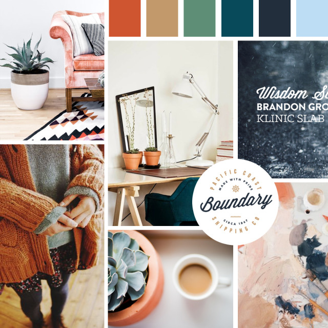
With the above inspiration board as my guide, I came up with a logo study (this image below was the first draft) and a quick website mock up. Just like the first project, we skipped a couple of steps in the process, and worked on the logo design and website design/development simultaneously. What can I say, that’s how we roll. :D
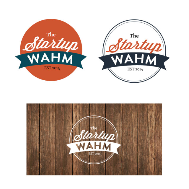
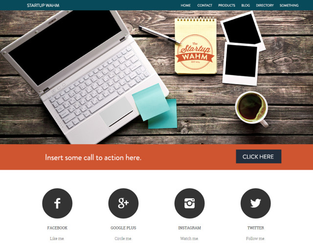
Read her thoughts about this project HERE.
Overall, it was such a pleasure working on these projects with Miss Marge, and picking her brain and learning a whole lot from her in the process—which I thought was the best part of it all. ;)
Thanks, Miss Marge, for the opportunity. I’m excited to have more collaborations with you this year and beyond. FISTBUMP!
 I offer wordpress, logo, and branding packages for creative people who dig modern and minimalist designs. Feel free to message me if you like what you see. Read my Design Process to know more. Or view my Design Portfolio and Facebook Page to get a feel of my work. Let’s create something beautiful together!

Hi Riz, I got to know about your work from Martine. :) I was wondering if you were interested in working with me for my blog’s, TheWiseLiving.com, redesign. I’m using Blogger, though! Kindly send me an email at liannemarthamlaroya@gmail.com so we can explore this :) Thanks!
Nice!!! Can’t wait to get started on our own partnership soon. ;)
Thanks Toni, me too!! :)